

Data analysis and visualization are vital skills in today’s data-driven world. These skills help turn raw data into valuable insights.
Whether you’re a beginner or looking to enhance your skills, finding the right course is crucial. With the rise in demand for data professionals, many courses promise to teach you the ropes. But not all of them deliver the same quality.
Some focus more on theoretical knowledge, while others emphasize practical application. The best courses offer a balance, ensuring you understand the concepts and can apply them effectively. In this blog post, we’ll explore 7 best data analysis and visualization courses. These courses will help you gain the knowledge and confidence needed to excel in this field. Let’s dive in and find the right course for you!

Top Data Analysis Skills
Data analysis and visualization are critical skills in today’s data-driven world. With the right courses, you can gain the expertise needed to interpret and present data effectively. Here, we discuss the top data analysis skills you can acquire from the best courses available.
Essential Techniques
Mastering essential techniques in data analysis is crucial. These skills form the foundation for any data analyst. They include:
- Data Cleaning: Removing inaccuracies and formatting data correctly.
- Data Exploration: Understanding data distributions and identifying patterns.
- Statistical Analysis: Applying statistical methods to interpret data.
- Hypothesis Testing: Testing assumptions and concluding.
- Data Visualization: Creating charts and graphs to present data.
These techniques help you make sense of large datasets. They also enable you to communicate findings clearly. Here’s a table summarizing the essential techniques:
| Technique | Description |
|---|---|
| Data Cleaning | Removing errors and inconsistencies from data. |
| Data Exploration | Identifying patterns and relationships in data. |
| Statistical Analysis | Using statistics to make sense of data. |
| Hypothesis Testing | Testing assumptions about data. |
| Data Visualization | Creating visual representations of data. |
Software Proficiency
Knowing the right software tools is equally important. These tools help you perform data analysis and visualization efficiently. Key software proficiencies include:
- Excel: Widely used for data manipulation and basic visualization.
- R: A programming language for statistical computing and graphics.
- Python: Versatile for data analysis with libraries like Pandas and Matplotlib.
- Tableau: Popular for creating interactive data visualizations.
- SQL: Essential for querying and managing databases.
Proficiency in these tools enhances your ability to analyze data. It also improves your efficiency and accuracy. Below is a table showcasing the key software tools and their uses:
| Software | Use |
|---|---|
| Excel | Data manipulation and basic visualization |
| R | Statistical computing and graphics |
| Python | Data analysis with libraries like Pandas and Matplotlib |
| Tableau | Interactive data visualizations |
| SQL | Querying and managing databases |
Learning these tools gives you an edge in data analysis. They are widely used in the industry and essential for any data analyst.
7 Best Data Analysis And Visualization Courses To Boost Your Skills
Data analysis and visualization are crucial skills in today’s data-driven world. Whether you’re a beginner or a professional, enhancing these skills can significantly impact your career. Here are the 7 best data analysis and visualization courses to boost your skills, each offering unique advantages to help you master data interpretation and visualization techniques. Real also 12 Top Skills to Learn in 2025
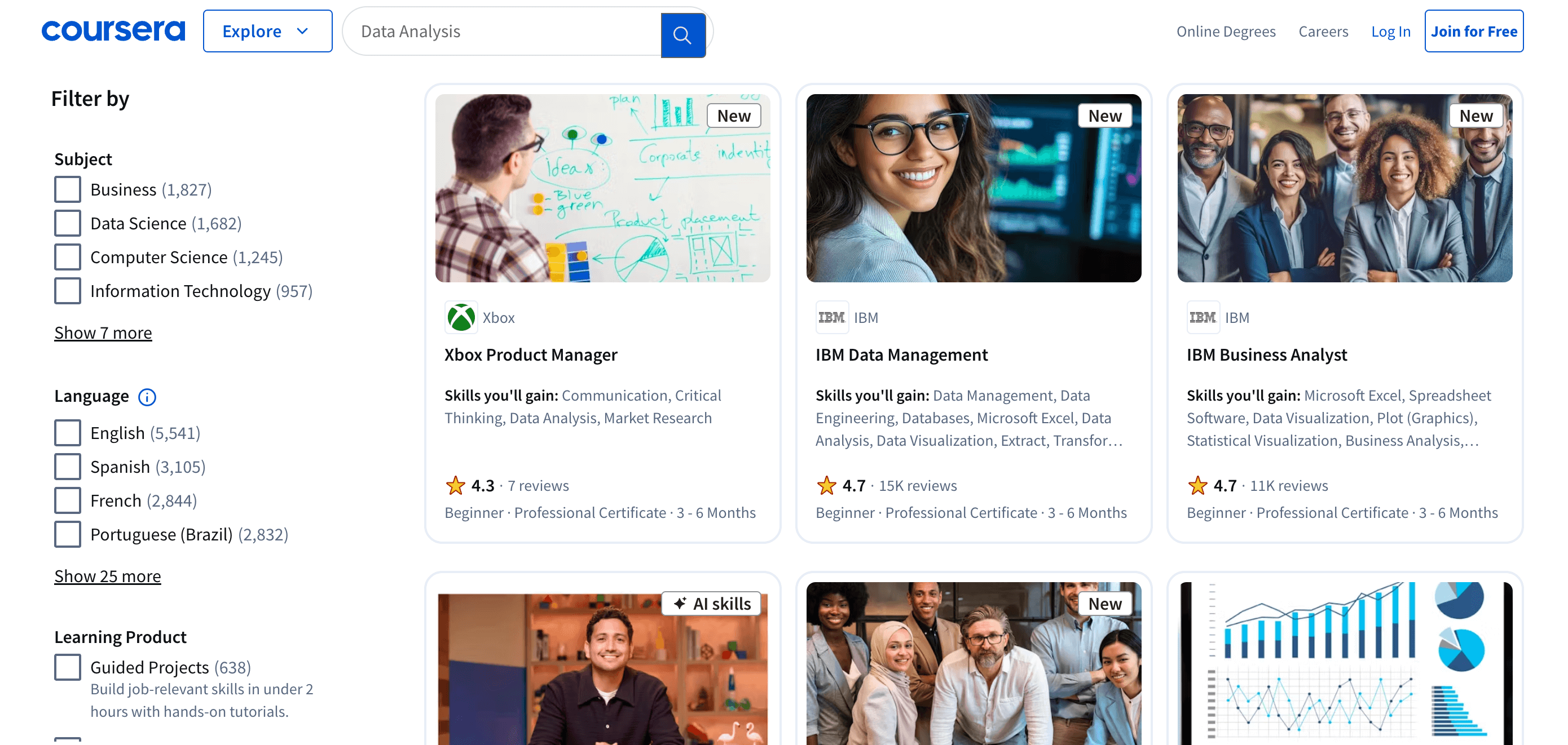
1. Coursera: Data Analysis And Visualization Specializations
Coursera offers comprehensive specializations in data analysis and visualization. These courses are crafted by top universities and industry leaders. They provide a structured learning path, covering essential skills in data-driven decision-making and analytics training. Key features include:
- Structured Learning Path: Courses are organized into specializations, ensuring a comprehensive understanding of the subject.
- Expert Instructors: Learn from professors and industry experts.
- Hands-On Projects: Apply your knowledge to real-world data sets.
- Certification: Earn recognized certificates upon completion.
Popular specializations include:
| Specialization | Institution |
|---|---|
| Data Science | Johns Hopkins University |
| Applied Data Science | University of Michigan |
| Business Analytics | Wharton School |
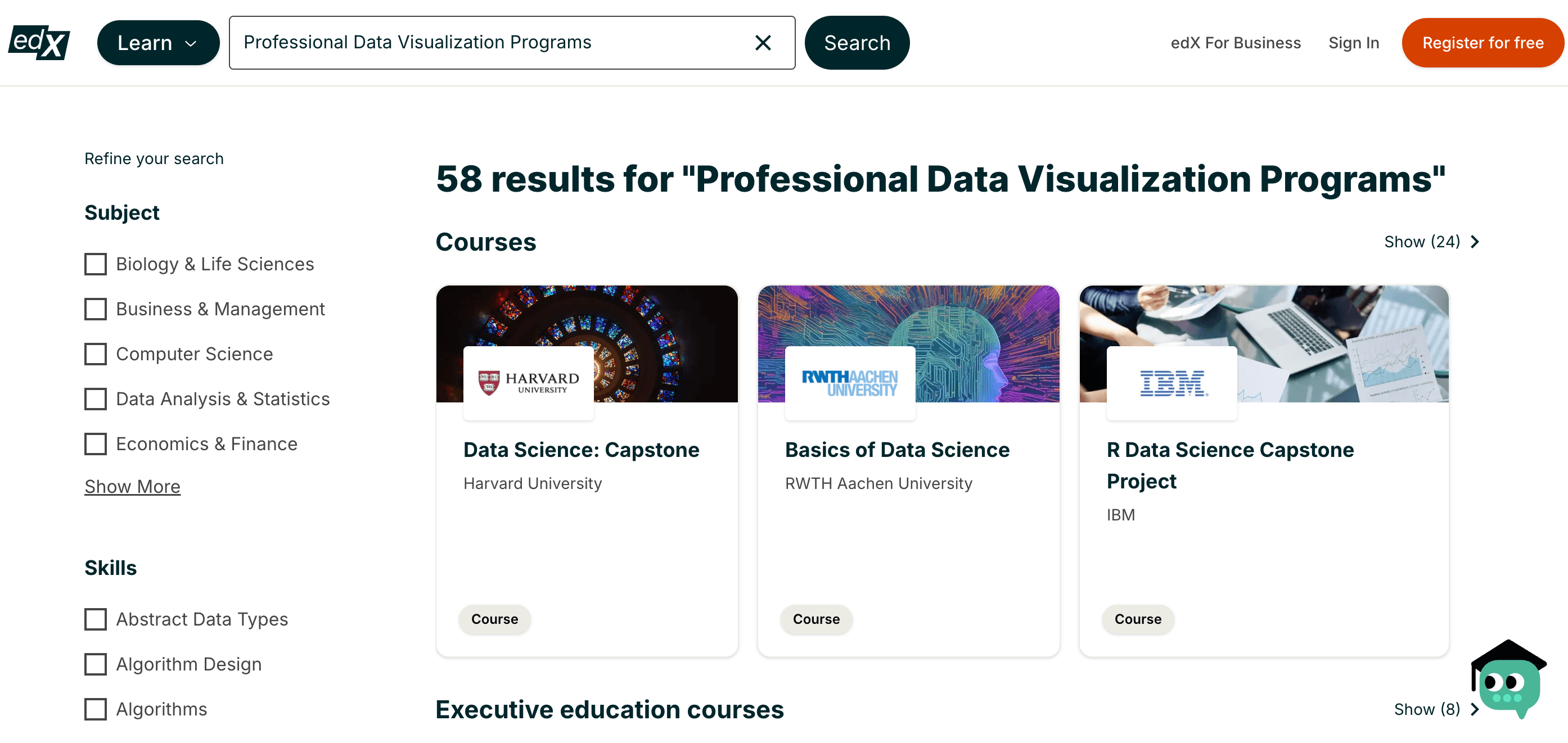
2. Edx: Professional Data Visualization Programs
edX provides a range of professional programs in data visualization, created by renowned institutions. These programs focus on practical applications and advanced visualization techniques. Benefits include:
- Professional Certification: Gain certificates from top universities.
- Flexible Learning: Self-paced courses to fit your schedule.
- Interactive Content: Engage with interactive exercises and projects.
Highlighted programs include:
| Program | Institution |
|---|---|
| Data Visualization with Python | Harvard University |
| Data Science MicroMasters | MIT |
| Professional Certificate in Data Analysis | Microsoft |
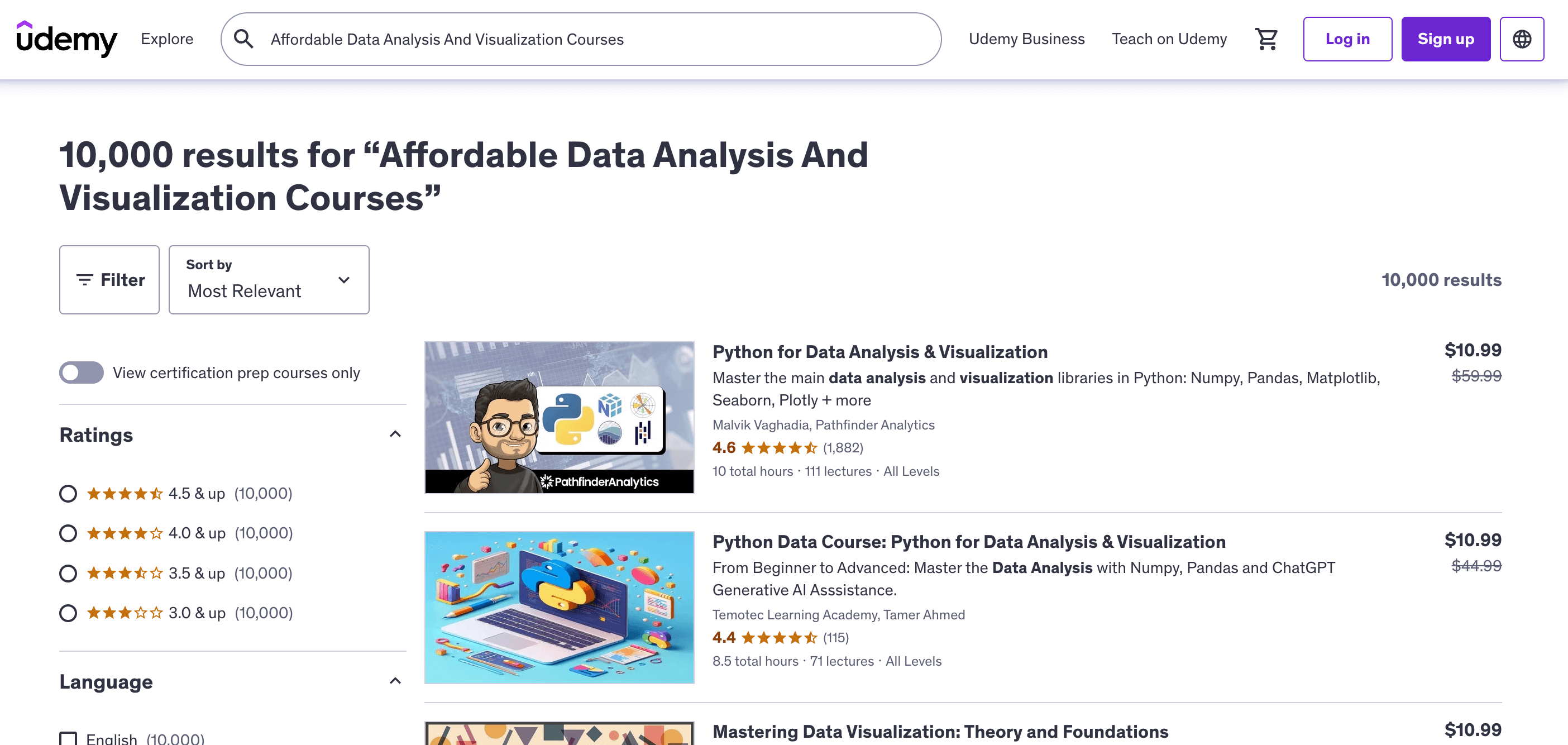
3. Udemy: Affordable Data Analysis And Visualization Courses
Udemy is known for its affordable and diverse courses in data analysis and visualization. These courses cater to various skill levels and budgets. Key features are:
- Wide Range: Thousands of courses to choose from.
- Budget-Friendly: Frequent discounts and promotions.
- User Reviews: Course ratings and reviews help you choose the best options.
Popular courses include:
| Course | Instructor |
|---|---|
| Data Science A-Z | Kirill Eremenko |
| Tableau 2023 A-Z | Kirill Eremenko |
| Python for Data Science and Machine Learning Bootcamp | Jose Portilla |
4. LinkedIn Learning: Practical Data Analysis For Professionals
LinkedIn Learning offers practical courses designed for professionals aiming to enhance their data analysis and visualization skills. Benefits include:
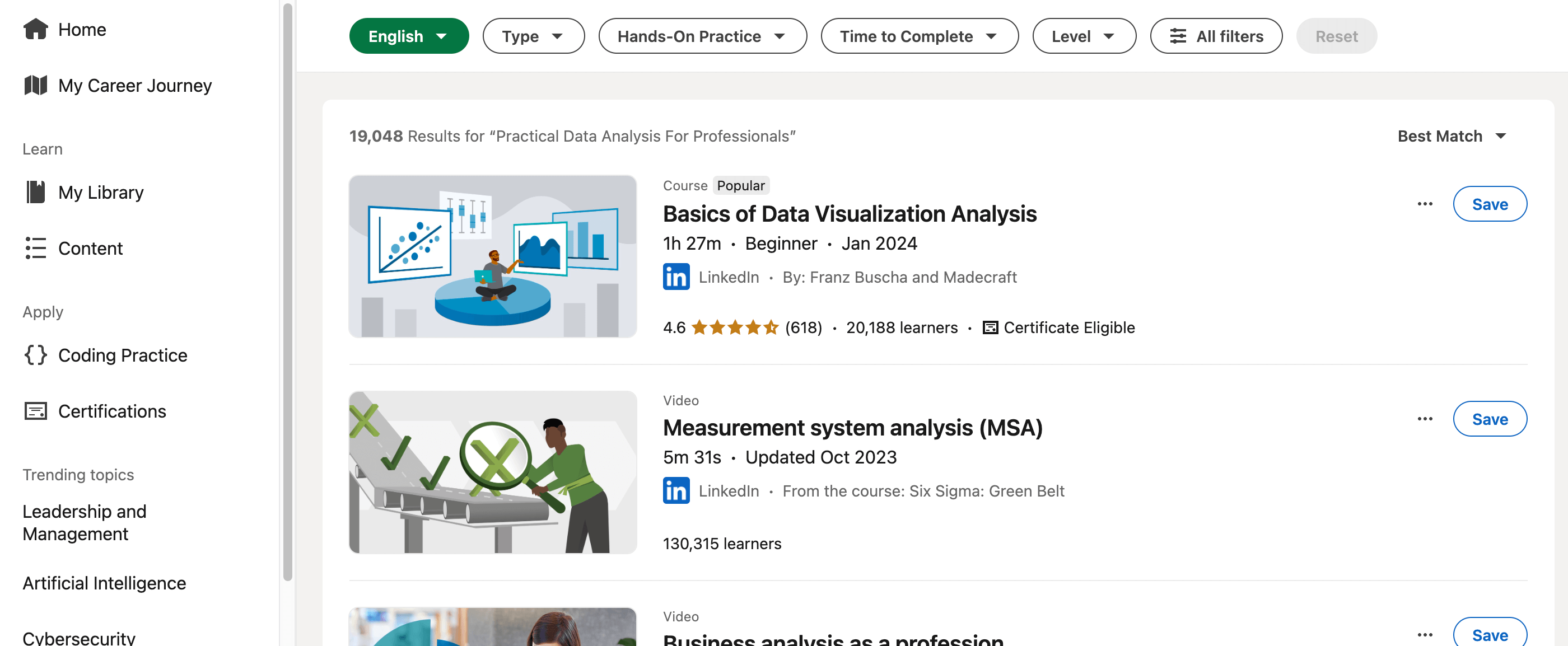
- Professional Focus: Courses tailored for working professionals.
- Industry Experts: Learn from experienced professionals in the field.
- LinkedIn Integration: Add completed courses to your LinkedIn profile.
Top courses include:
| Course | Instructor |
|---|---|
| Excel for Data Analysis | Michael McDonald |
| Learning Data Visualization | Bill Shander |
| Power BI Essential Training | Gini von Courter |
5. Datacamp: Hands-on Data Visualization Training
DataCamp specializes in hands-on training for data analysis and visualization. These courses emphasize practical skills through interactive learning. Key features include:
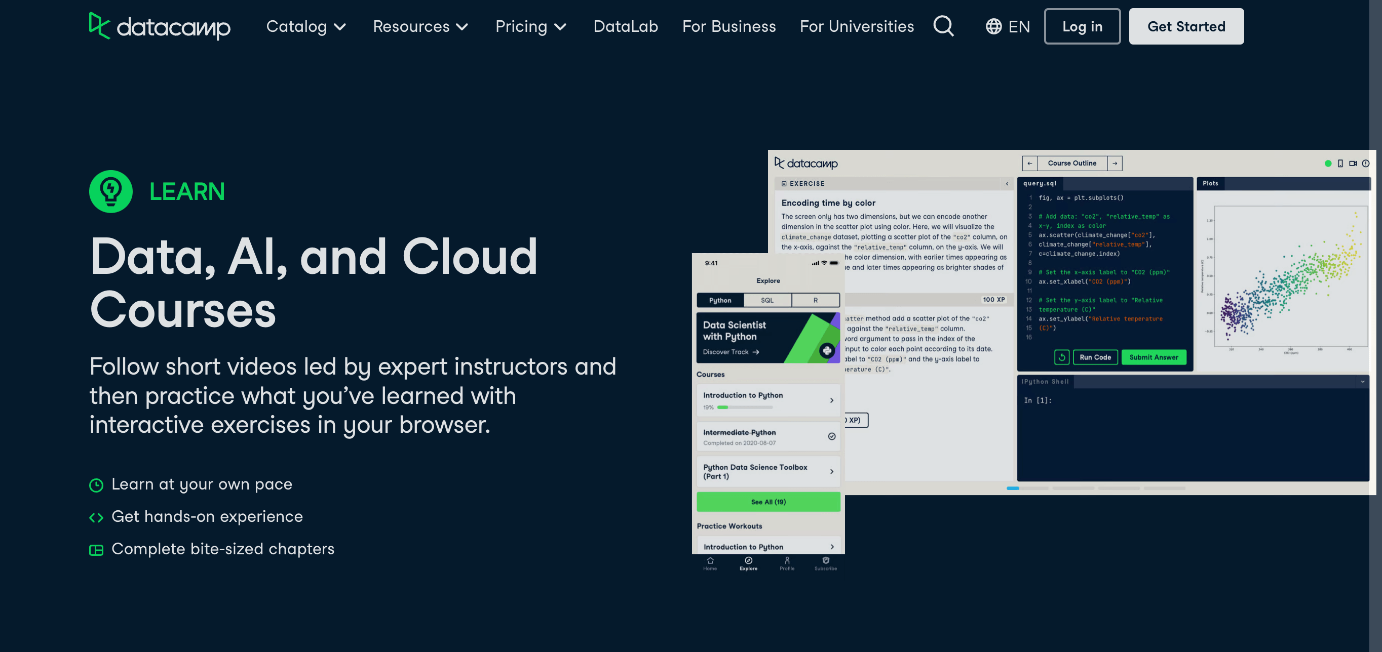
- Interactive Exercises: Learn by doing with code challenges and projects.
- Skill Tracks: Follow structured paths to master specific skills.
- Community Support: Engage with a community of learners and experts.
Popular tracks include:
| Track | Focus |
|---|---|
| Data Analyst with Python | Python Programming, Data Analysis |
| Data Visualization with R | R Programming, Visualization |
| Data Scientist with SQL | SQL, Data Manipulation |
6. Pluralsight: Advanced Courses For Data Analysis Experts
Pluralsight offers advanced courses for those who already have a solid foundation in data analysis. These courses are ideal for experts looking to deepen their knowledge. Highlights include:
- Advanced Content: Focus on specialized and advanced topics.
- Expert Instructors: Learn from industry leaders and experts.
- Skill Assessments: Track your progress with skill assessments.
Notable courses include:
| Course | Instructor |
|---|---|
| Advanced-Data Visualization with D3.js | Nathaniel Schutta |
| Machine Learning with Python | Jerry Kurata |
| Data Analysis with R | Robert Gentle |
7. Tableau Academy: Master Data Visualization With Tableau
Tableau Academy is dedicated to mastering data visualization using Tableau software. These courses cater to all levels, from beginners to advanced users. Features include:
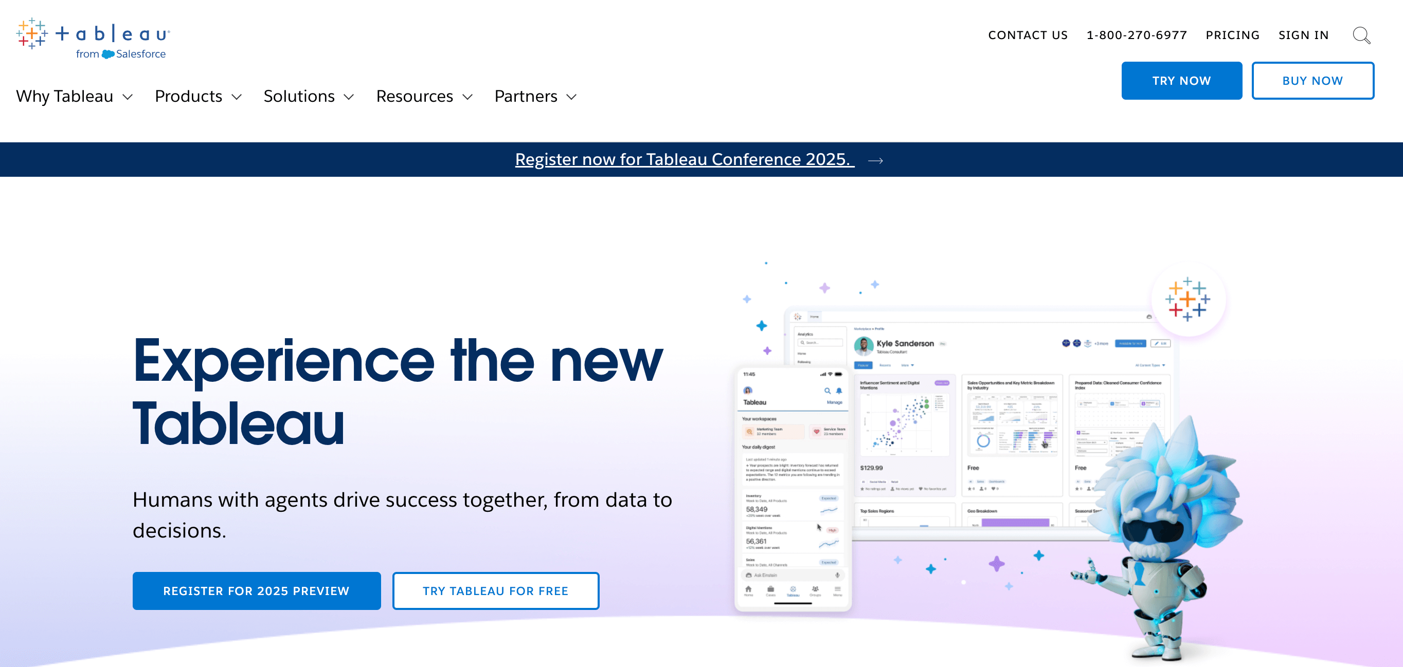
- Comprehensive Training: Cover all aspects of Tableau from basics to advanced techniques.
- Practical Application: Learn through real-world projects and case studies.
- Certification Prep: Prepare for Tableau certification exams.
Highlighted courses include:
| Course | Level |
|---|---|
| Tableau Desktop Specialist | Beginner |
| Tableau Desktop Certified Associate | Intermediate |
| Tableau Server Qualified Associate | Advanced |
You can learn also the Top 5 Cybersecurity Courses 2025
Importance Of Data Visualization
In today’s data-driven world, understanding and presenting data is crucial. The 7 Best Data Analysis and Visualization Courses can help you master these skills. One key aspect of these courses is the Importance of Data Visualization. Let’s explore why this is so essential.
Communicating Insights
Effectively communicating insights from data is vital. Without a clear presentation, valuable information might be overlooked. Data visualization turns complex data into understandable visuals. These visuals help convey the story behind the numbers.
Consider the following advantages:
- Clarity: Charts and graphs make trends and patterns easier to see.
- Engagement: Visuals are more engaging than raw data.
- Efficiency: Quick understanding of large datasets.
For instance, Tableau Visualization tools are widely used in business intelligence. They transform data into actionable insights. Professionals use these tools to make data-driven decisions quickly.
Data storytelling is another key element. It involves creating a narrative around your data. This narrative helps stakeholders understand the significance of the data. Courses on Python for Data Analysis often include modules on effective data storytelling.
Let’s look at a simple example:
| Data Type | Visualization Tool |
|---|---|
| Sales Data | Bar Chart |
| Customer Demographics | Pie Chart |
| Website Traffic | Line Graph |
In Data Science Courses, students learn to use these tools. They also learn how to tailor their message to their audience. This skill is essential in analytics training.
Enhancing Understanding
Enhancing understanding is another crucial aspect of data visualization. Visual representations simplify complex data. This makes it easier for everyone to grasp key points. Even those without a technical background.
Consider the following benefits:
- Accessibility: Visual data is easier to understand for non-experts.
- Retention: People remember visual information better.
- Actionability: Clear visuals lead to quicker decision-making.
For example, statistical analysis often involves large datasets. Visuals help break down this information into manageable pieces. This is particularly useful in business intelligence. Decision-makers can see the big picture at a glance.
Machine learning models also benefit from visualization. Visual tools can show how these models work. They can also highlight the results. This makes the complex algorithms more understandable.
Here’s a breakdown of visual types and their uses:
| Visualization Type | Purpose |
|---|---|
| Scatter Plot | Show relationships between variables |
| Heat Map | Display data density |
| Histogram | Show data distribution |
These tools are often covered in Data Analysis and Data Visualization courses. They equip learners with the skills needed to make data accessible and understandable. By enhancing understanding, data visualization empowers better decision-making. This is a key takeaway from any analytics training.
Course Criteria
Choosing the right data analysis and visualization course can be challenging. With so many options available, it’s important to understand what makes a course valuable. Here, we discuss the criteria to consider when selecting the best courses in this field.
Content Quality
High-quality content is essential for a good learning experience. Here are some factors that indicate strong content quality:
- Comprehensive Coverage: The course should cover all essential topics such as data cleaning, data visualization techniques, statistical analysis, and the use of tools like Python, R, or Tableau.
- Up-to-date Material: The content should reflect the latest trends and technologies in data analysis and visualization.
- Practical Examples: Courses with real-world examples and case studies help in understanding the application of concepts.
- Interactive Elements: Quizzes, assignments, and projects can significantly enhance the learning experience.
| Course Feature | Description |
|---|---|
| Comprehensive Coverage | Includes all essential topics like data cleaning, visualization techniques, and statistical analysis. |
| Up-to-date Material | Reflects the latest trends and technologies in the field. |
| Practical Examples | Real-world examples and case studies for better understanding. |
| Interactive Elements | Quizzes, assignments, and projects to enhance learning. |
Instructor Expertise
The expertise of the instructor plays a crucial role in the effectiveness of the course. Key aspects to look for include:
- Industry Experience: Instructors with hands-on experience in data analysis and visualization bring valuable insights to the course.
- Educational Background: A strong academic background in relevant fields such as computer science, statistics, or data science is important.
- Communication Skills: Clear and engaging communication makes complex topics easier to understand.
- Student Feedback: Positive reviews from past students can indicate the instructor’s ability to teach effectively.
| Instructor Attribute | Description |
|---|---|
| Industry Experience | Hands-on experience in data analysis and visualization. |
| Educational Background | Strong academic background in computer science, statistics, or data science. |
| Communication Skills | Clear and engaging communication for easy understanding of complex topics. |
| Student Feedback | Positive reviews from past students indicate effective teaching. |
Choosing The Right Course
Choosing the right data analysis and visualization course can be challenging. With so many options available, it’s important to select a course that fits your needs and goals. Understanding your personal learning style and career objectives can help narrow down the choices. Here are some tips to guide you in making an informed decision.
Personal Learning Style
Everyone learns differently. Knowing your learning style can help you choose a course that suits you best. Here are some factors to consider:
- Visual Learners: If you learn best through images and diagrams, look for courses with plenty of video content and visual aids.
- Auditory Learners: Prefer listening to explanations? Courses with lectures, podcasts, and voice-over presentations might be more effective for you.
- Reading/Writing Learners: If you grasp information better through reading and writing, choose courses with comprehensive written materials, textbooks, and quizzes.
- Kinesthetic Learners: Hands-on practice is key for you. Look for courses with interactive exercises, coding projects, and real-world applications.
Some courses offer a mix of these learning styles. This can be beneficial if you don’t have a strong preference. Here’s a quick reference table:
| Learning Style | Recommended Course Features |
|---|---|
| Visual | Videos, diagrams, infographics |
| Auditory | Lectures, podcasts, discussions |
| Reading/Writing | Text materials, quizzes, articles |
| Kinesthetic | Projects, coding exercises, labs |
Identifying your preferred learning style can significantly enhance your learning experience and help you retain information better.
Career Goals
Your career goals should heavily influence your course choice. Here are some factors to consider:
- Entry-Level Positions: If you’re new to the field, look for beginner-friendly courses that cover the basics of data analysis and visualization.
- Advanced Roles: For those aiming for senior positions, consider courses that delve into advanced techniques and tools like machine learning and big data analytics.
- Certification: Some roles require formal certification. Check if the course offers a recognized certificate upon completion.
- Industry-Specific Skills: Different industries use different data tools. Choose a course that focuses on the tools and techniques relevant to your industry.
Here’s a guide to help match courses to career stages:
| Career Stage | Course Focus |
|---|---|
| Beginner | Basic data analysis, Excel, introductory statistics |
| Intermediate | SQL, Python, data visualization tools |
| Advanced | Machine learning, big data, specialized software |
Aligning your course choice with your career goals ensures you gain the skills needed for your desired job. This targeted approach can make your learning journey more effective and relevant.

Future Of Data Analysis
Data analysis is a vital skill in today’s digital world. With the right courses, you can learn to make sense of vast amounts of data. This helps in making informed decisions. The future of data analysis looks bright with many advancements on the horizon. Let’s dive into the future of data analysis and explore the emerging trends and career opportunities in this field.
Emerging Trends
The field of data analysis is evolving rapidly. New trends are shaping the way data is collected, analyzed, and visualized. Here are some of the emerging trends:
- Artificial Intelligence (AI) and Machine Learning (ML): AI and ML are transforming data analysis. They help in making predictions and finding patterns that are not visible to the human eye.
- Big Data: The volume of data generated every day is massive. Big data technologies like Hadoop and Spark help in managing and analyzing this data efficiently.
- Real-Time Data Processing: Businesses need real-time insights to stay competitive. Tools like Apache Kafka enable real-time data processing and analysis.
- Data Visualization: Visualizing data helps in understanding complex data sets easily. Tools like Tableau and Power BI are becoming more popular.
- Data Privacy: With the rise in data breaches, data privacy is a major concern. Regulations like GDPR and CCPA are shaping the way data is handled.
These trends indicate that data analysis will become even more important in the future. Staying updated with these trends is crucial for anyone in the field.
Career Opportunities
The demand for data analysts is growing. There are many career opportunities in this field. Here are some of the popular roles:
- Data Analyst: Data analysts collect, process, and analyze data to help businesses make informed decisions.
- Data Scientist: Data scientists use advanced techniques like machine learning to analyze large data sets and make predictions.
- Business Intelligence Analyst: BI analysts use data to help businesses improve their strategies and operations.
- Data Engineer: Data engineers build and maintain the infrastructure needed for data analysis.
- Data Visualization Specialist: These specialists create visual representations of data to help others understand complex information.
Here is a table summarizing the roles, required skills, and average salaries:
| Role | Required Skills | Average Salary |
|---|---|---|
| Data Analyst | SQL, Excel, Data Visualization | $60,000 – $85,000 |
| Data Scientist | Python, R, Machine Learning | $90,000 – $120,000 |
| BI Analyst | SQL, BI Tools, Data Modeling | $70,000 – $95,000 |
| Data Engineer | Python, Java, Big Data Tools | $80,000 – $110,000 |
| Data Visualization Specialist | Tableau, Power BI, Data Storytelling | $65,000 – $90,000 |
The future of data analysis offers many exciting career paths. With the right skills and knowledge, you can take advantage of these opportunities.
Frequently Asked Questions
What Are The Top Data Analysis Courses?
The top courses include those from Coursera, edX, and Udemy. They offer comprehensive material on data analysis techniques and tools.
Which Visualization Courses Are Best For Beginners?
Courses like “Data Visualization with Python” by IBM and “Tableau 2021 A-Z” on Udemy are great for beginners. They cover fundamental concepts clearly.
Are These Courses Free Or Paid?
Most of these courses are paid. However, some platforms offer free trials or financial aid for certain courses.
How Long Do These Courses Take To Complete?
Course durations vary. Most take between 4 to 12 weeks. Some self-paced options may allow quicker completion.
Conclusion
Choosing the right data analysis course can enhance your skills significantly. The courses listed offer unique benefits and cater to various learning styles. They cover essential topics and practical applications. Whether you are a beginner or looking to advance, there is a course for you.
Invest time in learning and practice regularly. This will help you achieve your data analysis goals. Start your journey today and become proficient in data visualization and analysis. Happy learning!